Having a fruitful and successfully-running online store is a primary aim for eCommerce owners. But there are so many fatal pitfalls, inexcusable mistakes, and commonly taken wrong turns that impact the business too negatively that you should be aware of. In this article, we’ll reveal eCommerce mistakes not to repeat to avoid the loss of your customers, revenue, and destructive consequences.
Mistake # 1: You Chose the Wrong eCommerce Platform
Is your platform a good match for your business? Fair enough, it all begins with the choice of platform that your eCommerce store is based on. With the plethora of available options, it is crucial to take some time to select the right platform that’ll be able to cope with your site’s volumes and support the desired functionality. Otherwise, if something goes seriously wrong, you’ll be cornered with the necessity to either migrate your store or rebuild it from the ground up. Some platforms, such as WordPress Commerce, are pretty intuitive for non-technical users, other more complex and highly customizable ones, such as Magento, require professional Magento developers to build and optimize the store.
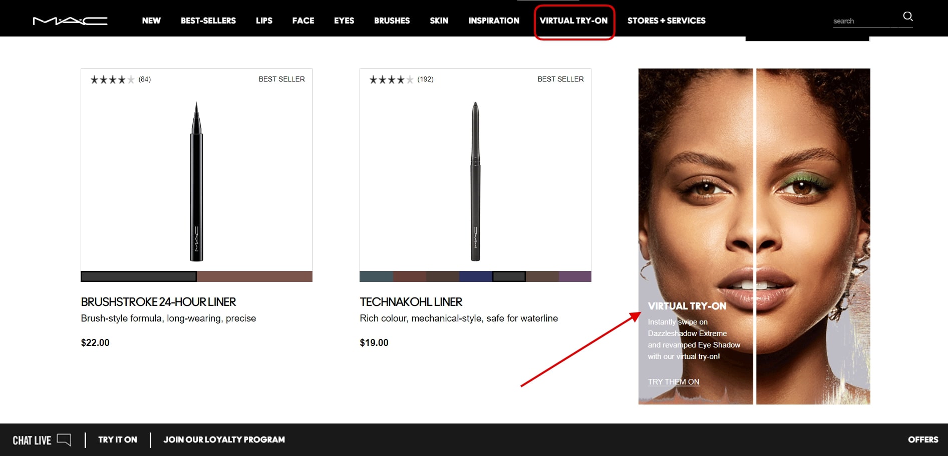
It ultimately depends on what you want to achieve as a result. For example, maybe you want your online store to be fitted with advanced functionality like virtual try-on (as displayed below on the screenshot that was taken on the official MAC Cosmetics website), but your platform can’t offer you this due to its own technical limits. At the end of the day, your business could have “outgrown” the functionality scope of the platform that was used initially, maybe it’s time for a change?

Source: Screenshot from the official MAC Cosmetics website, learn how to avoid eCommerce mistakes
Mistake # 2: Having Poor Site Navigation, Search, Menu, and Other Irrational UX\UI Decisions
Are your UX and UI great? Are you sure? The designs and themes that are used in your online store are no less important than your product lines and prices. After all, top-notch UX/UI is responsible for making your eCommerce website easy to shop on. This regards not only the visual appeal of your pages, but it’s also about intuitive navigation and easy to locate items. The bottom line is that you’ll just be losing clients if they don’t manage to find what they were looking for.
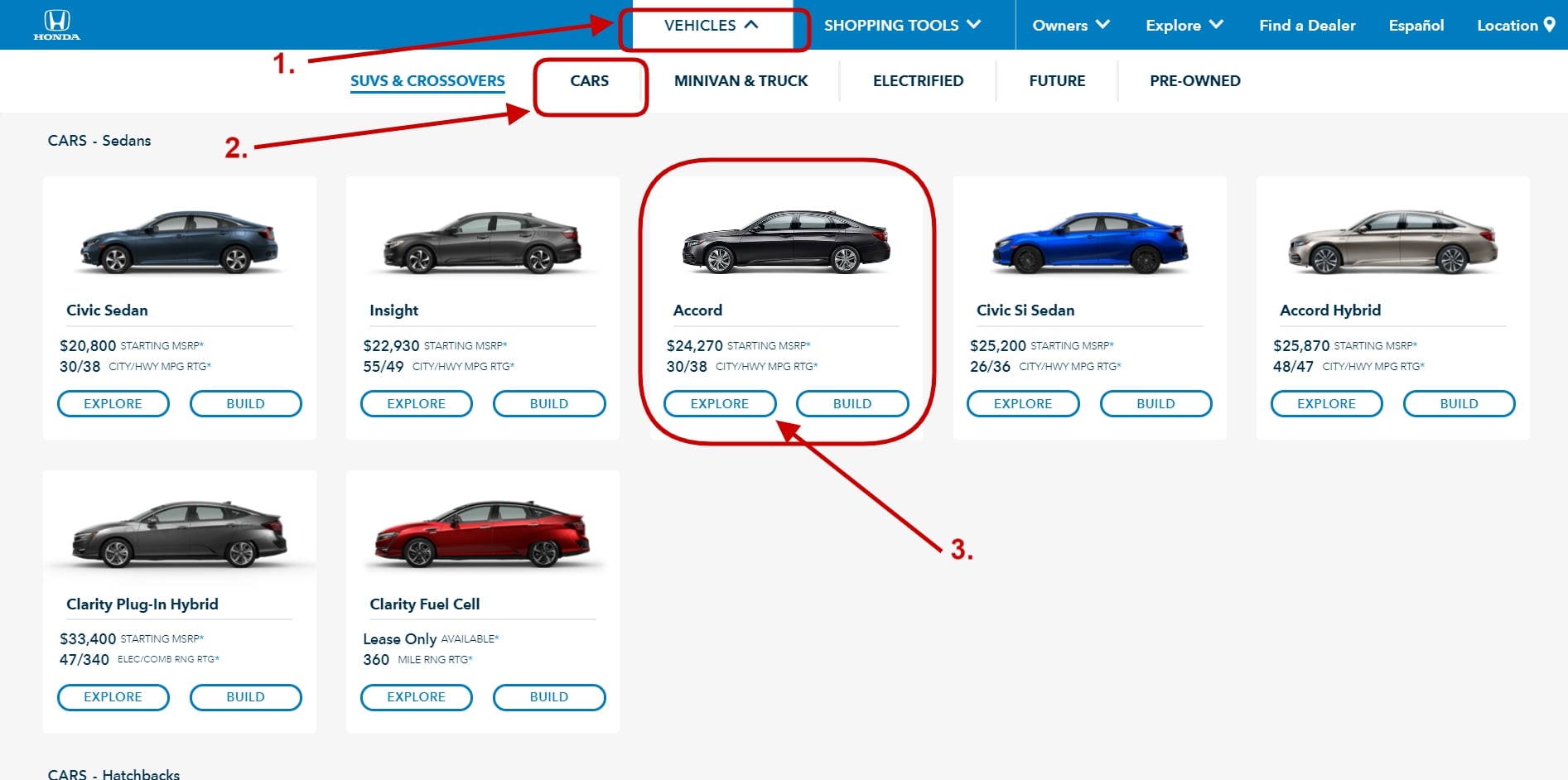
Giving you a specific example, as you work on your product categorization, aim towards elementary hierarchy, simple category breakdown, and filter parameters. Even if you have an enormous number of various products on sale, don’t create complex menus. Instead, ideally, place each product as far as three or four clicks away from the homepage. Take a look at the official Honda Auto website, every car model is reachable in as little as 3 clicks.

Source: Screenshot from the official Honda Auto website, learn how to avoid eCommerce mistakes
Mistake # 3: Having a Slow & Unoptimized Online Store
Is your website optimized and performing at it’s best? If it’s not, you’re in trouble. Your online store should be functioning glitch-free from a technical perspective. All bugs must be fixed if they occur, and this must be done immediately.
Imagine the frustration of a client who’s disturbingly tapping a button that doesn’t work or trying to close a pop-up window that doesn’t close. These are red flags you, by all means, don’t want to encounter. Despite everything, you don’t want people to leave your store without making a purchase when so much was done and spent on getting them to browse it in the first place.
The same goes for speed optimization, it’s among the most important points to pay attention to. Slow page load times lead to users getting annoyed and closing the page in their browser. And this is the potential money you’ve lost because your client wasn’t patient enough to buy from you.
Mistake # 4: Neglecting Your Product Page Elements
Let’s start with the basics, your product pages are the ones that get the most focus from users, meaning that these pages should be flawless.
To begin with, product galleries must consist of outstanding images of the best quality imaginable. Large visuals with the opportunity to see the tiny details of the item are the best practice to follow. Keep in mind, though, that in order to not jeopardize the slowdown of page load, all visuals should be compressed and optimized in size.
Copy-pasting product descriptions is an unforgivable taboo. These texts should bring value, highlight strong points, be well-structured and of adequate volume, use keywords, and be engaging to read. If they’re not, think again. If there’s anything you can additionally tell about the product and its unique qualities, do it. If you have professional videos or photos made by your clients, add them.
Show your buyers that you know them and their tastes. Not going for personalization is a misstep. This approach should be used in your texts and, in an ideal case scenario, a block that would collect items that the person might like is another “must”. By having such an element on the page, you raise the chances of your client putting additional items into their cart/bag.
The testimonials of customers who have bought your products are the biggest influence leverage on purchasing decisions. Therefore, not having product feedback sections directly on the product page is a major overlook.
Correctly laid-out SEO data is the next point on the checklist not to forget about. Your product pages should be optimized for search engines, this way, there’s a bigger chance that users will find your website over competitors. Metadata is one side of it, keyword use, page structure (headings, subheadings, bullet points, image alternative texts, etc) is the other. Even the naming of the photos and the words that form the page link count here. Thus, mind your SEO, this side of marketing is really worth the input time.
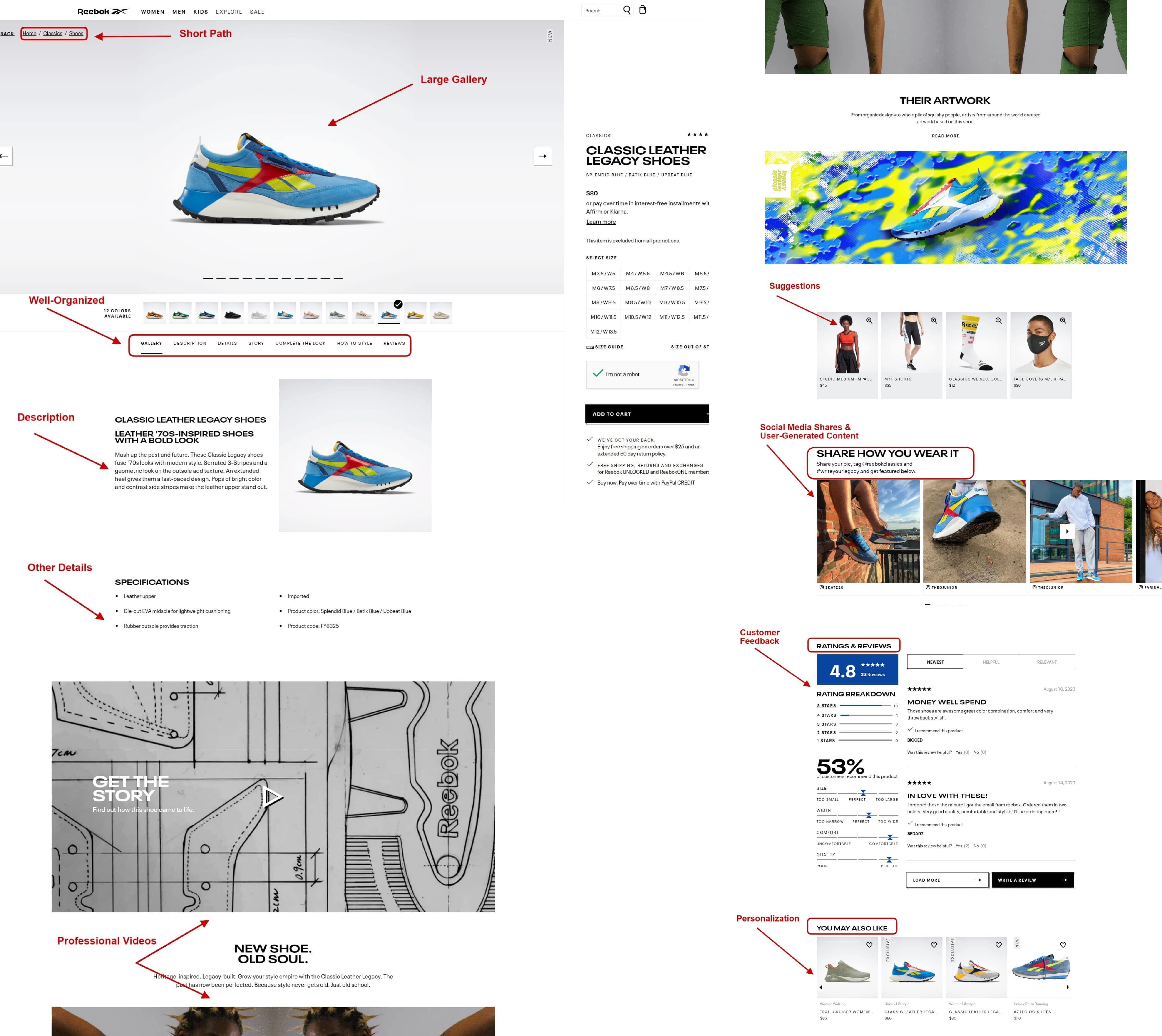
A pretty good example of how all the mentioned in this fourth point is incorporated in a product page is shown on the screenshot from the official Reebok website.

Source: Screenshot from the official Reebok website
Mistake # 5: Not Giving Enough Attention to the Mobile Version
Is your online store just as great on a mobile device as its desktop version? If it’s not, place this point at the top of your “to-do” list. A gigantic percentage of eCommerce sales falls on those that were made using mobile devices. And their number only keeps on going up. In case your mobile version isn’t great, you’re losing money every single day.
In fact, many eCommerce businesses are currently moving their sites mobile-first and using more modern and advanced technology, progressive web applications. Such PWA websites are very quick and easy to use, importantly, they look and behave like a native application but without the required direct download to the device.
Mistake # 6: Not Optimizing Your Checkout
Struggling with too many abandoned carts? There’s a very large possibility that this is happening because your checkout isn’t great. Optimizing the checkout process can lead you to more sales.
That said, having an extensive checkout with too many multi-steps is not great. On the contrary, placing only the needed things on one page makes sense. This way, your clients don’t get intimidated or unhappy about the time-consuming “work” that they have ahead as they fill out their data to finalize the purchase.
One more reason why carts are abandoned is the lack of available payment methods. Not finding the option that they would prefer to pay in, many people leave the website and continue looking for alternatives in other stores. So, ultimately, do what you can to make it easy to pay you.
The same applies when the site offers scarce shipping and delivery methods, or when the registration on the website is obligatory for buying something, or when customers stumble upon hidden fees. These three things cause people to leave their shopping bags and store checkouts too. Thus, make your own conclusions.
Mistake # 7: Not Safeguarding Your Store
Are you sure that your store stands strong to defend itself from hacks? As an eCommerce store, you take full responsibility for keeping the client data safe. Provided that there is a leak and the credit card information or contact details are spilled out or hacked, lawsuits, huge fines, and very unpleasant litigation await you ahead. So, giving your website’s security extra attention, keeping up all patches up-to-date, as well as taking all preventive measures is more of an obligation rather than a suggestion.
Mistake # 8: Not Using Social Media to the Most
Even if millennials aren’t your primary target audience, not using social media for your eCommerce business is a shame, no, actually, it’s a crime. It’s no secret that social media stepped far beyond being just a means of communication and a way to share the news. It provides the opportunity to sell things via social media shops. Therefore, if your eCommerce business doesn’t have social media business accounts (Facebook, Instagram, Pinterest, etc) that are linked to your product catalog, again, consider that you’re losing money.
This is an example of how the official Tommy Hilfiger Instagram account uses the Shop functionality. The items that are depicted in the photo of the post are tagged, when tapped on, there’s information on the price and a link to the online store. Yes, it’s as simple as that to sell on social media. Note, though, that such Instagram functionality is available from mobile devices only.

Source: Screenshot from the official Tommy Hilfiger Instagram, learn how to avoid eCommerce mistakes
Mistake # 9: Not Inspiring Your Clients
Cursorily touched upon earlier, the topic of user-generated content is a big thing not to miss out on in eCommerce. Just as social media can help you sell off your site, showing posts made by your customers can give inspiration to others to buy something. This includes client-contributed images, content, product reviews, etc.
By providing your clients the opportunity to make contributions that will get featured on your website, you gain multiple wins. More free content for you (which gets seen by your customers’ followers on their accounts and by your prospects on the store’s site), the more online presence for you, the more followers for your accounts, the more traffic to your store, just to name a couple. But most importantly, this can urge potential buyers to hit the checkout.
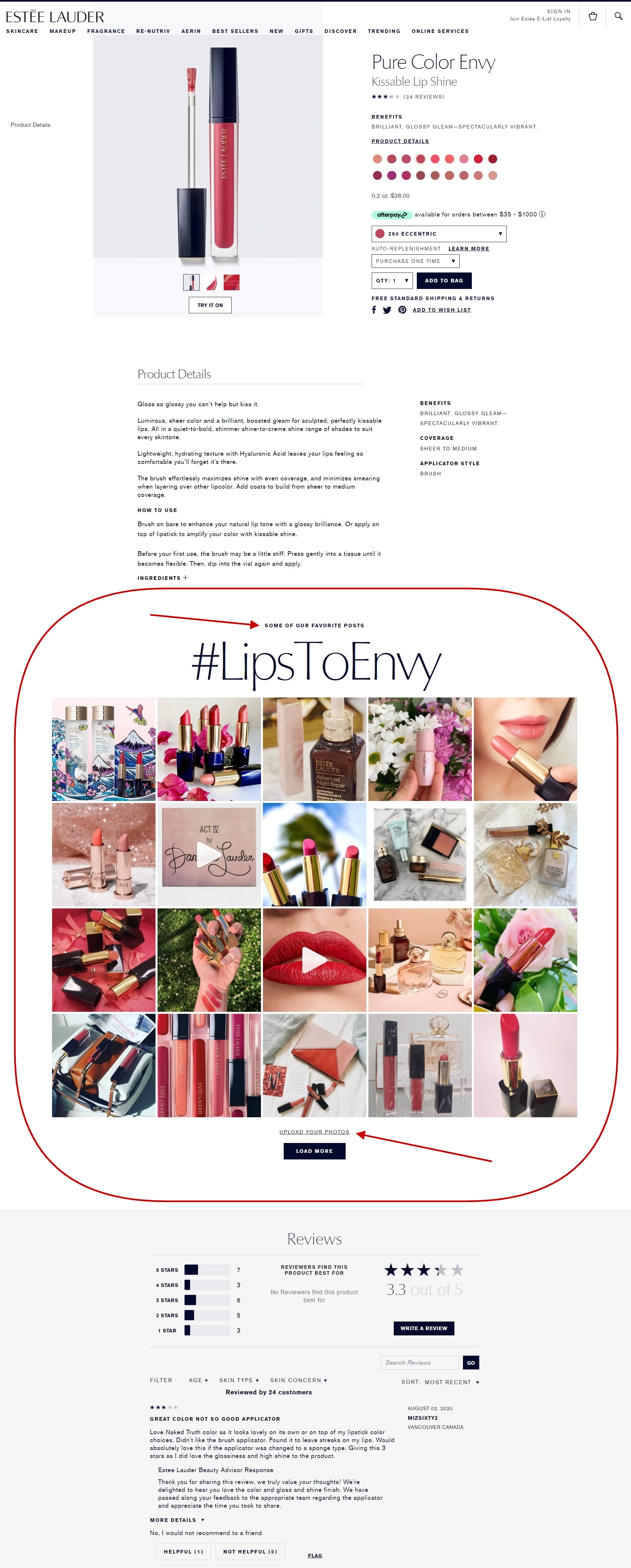
Just take a look at the size of the UGC section with the gallery of posts by clients on the official Estee Lauder website. Did you notice that it’s followed by client reviews?

Source: Screenshot from the official Estee Lauder website, learn how to avoid eCommerce mistakes
Mentioning other ways to motivate your customers, coupons, special offers, deals, and other sweeteners are a great tactic. But more on that in the next point.
Mistake # 10: Giving Customer Retention Little Attention
Lastly, are you leaving no stone unturned when it comes to retaining customers? Those customers who have already done business with you are much more likely to build a relationship with you and buy from your store again. It’s easier to sell something to them than to those customers who you haven’t acquired yet.
So what can you do to increase customer retention? Start loyalty programs that’ll offer clients some benefits. For example, the official Calvin Klein website gives perks for signing up for their preferred loyalty program. Some of these rewards include gifts for the customer’s birthday and access to special discounts.

Source: Screenshot from the official Calvin Klein website, learn how to avoid eCommerce mistakes
Speaking of discounts and coupons, don’t forget about your post-sale communication. Even simple mail-outs can already be a good step. In these messages, you can offer to give a bonus, say, in return for the customer leaving a review on the product that they’ve bought from you.
Final Say About eCommerce Mistakes
On the last note, it is worth saying that not doing anything and not striving to improve what you have already done on your online store is, perhaps, the silliest mistake of all. Remember that ignoring issues, taking too long to make things right, or even more so not wanting change for the better won’t lead to positive results. Join the discussion below in our commenting section about “avoid eCommerce mistakes”, what did catch your attention, what else did you experience? Share your opinion.


![The Many Watches of James Bond [Infographic] Many Watches of James Bond](https://www.skillzme.com/wp-content/uploads/2025/02/hero-image-Many-Watches-of-James-Bond-200x200.jpg)
![Poor Cell Phone Etiquette Statistics [Infographic] Poor Cell Phone Etiquette Statistics](https://www.skillzme.com/wp-content/uploads/2025/02/hero-image-Poor-Cell-Phone-Etiquette-Statistics-200x200.jpg)


Looking forward to reading more. Great article post. Much thanks again. Fantastic.
You have brought up a very superb details , thanks for the post.
Thanks a lot for the blog article. Really looking forward to read more. Fantastic. Allyce Nathan Dougherty
Just beneath, are quite a few totally not related web sites to ours, having said that, they may be surely worth going over. Audy Anders Morrie