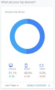

I know it from myself, the first thing in the morning I do, is to check my emails on my mobile phone while drinking my coffee. Google stated two-thirds of emails are now opened on mobile devices. It is essential to make your email campaigns mobile-friendly.
You can note the same statement from Google in their Gmail usage report. “Mobile users spend the majority of their time on mobile devices inside apps. More than 70% of people read their email in a mobile app, with most checking their email in the morning.”
Your subscribers are picky about the reading experience: Many of them delete emails that don’t show properly on mobile devices. But it can get other than this, some of them unsubscribe immediately if the emails can’t be read properly. This has an enormous impact on maintaining the power of your email marketing, your mailing list and communication with your clients over the best performing digital marketing channel.
What applies to emails, applies equally on your website, mobile is the way people experience your website. Remember, your email is hopefully backlinking to your website products and services.
Briefly, we can see it is mandatory to make your email marketing campaign mobile-friendly and easily readable to succeed.
In the infographic, you can learn with 8 tips on how to improve your email marketing campaign results.
Subject lines: 47% of email recipients decide whether to open an email based on the subject line alone. And since mobile devices show only 25-30 characters, you must be brief to capture their attention
Pre-header text: The teaser text underneath your subject line can indicate the difference between users eagerly opening or deleting the email. Summarize offers so recipients are compelling to click.
Personalization: Mass blasts remain a thing of the past. Personalized emails have 6x higher transaction rates. Segmented audience to send fewer, more relevant emails that suggest products based on past purchases or include the recipient’s first name/location.
Calls to action: Emails with a single CTA can increase clicks 371% and conversions 617%. For maximum clickability, keep CTAs to 2-4 words, choose a high contrast button color, place CTAs near the top of your email and size the button at least 44 x 44 px.
Use of limited space: Mobile screens get crowded fast. Without enough space around CTAs and links, recipients can accidentally click on the wrong link, leaving them frustrated. Keep links to a minimum and don’t stack them.
Concise Copy: Use bulleted lists and short paragraphs lo create scannable chunks of content that are easy for readers to digest and act on. Increase font size for easier skimming and to prevent people from zooming in to make text readable.
Testing (device types and email clients): Find out what email clients and devices your particular subscribers are using, then test and optimize for those formats. Tools like Litmus allow you to test your email messages on various clients so you can fix any visual problems that might occur across devices.
Single Column Layout: Follow a simple and easily scrollable design layout and keep all your CTAs in a direct line of sight.
Now you are equipped to perform your successful email campaign. Creating mobile-friendly emails is no longer optional. The infographic “8 Tips for Making Email Campaigns Mobile-Friendly” was prepared by CleverTap, who offers an intelligent mobile marketing platform.

Statistics

Mobile vs Desktop vs Tablet statistics

![Harnessing Linkedin’s Professional Network For Growth [Infographic] Linkedin’s Professional Network](https://www.skillzme.com/wp-content/uploads/2025/02/hero-image-Linkedins-Professional-Network-200x200.jpg)
![The Construction Labor Shortage [Infographic] hero-image-addressing-the-construction-labor-shortage](https://www.skillzme.com/wp-content/uploads/2025/01/hero-image-addressing-the-construction-labor-shortage-200x200.jpg)
![101: What is Social Media Marketing and Advertising? [Infographic] 101: What is Social Media Marketing and Advertising?](https://www.skillzme.com/wp-content/uploads/2025/02/hero-image-Social-Media-Marketing-and-Advertising-200x200.jpg)


Recent Comments